Concert-image

Concert Application

Project brief

Concert Application

#UX/UI design #SaaS Product Design #Customer Relations Management

Timeline:
Timeline May 2023(ongoing)

My Role
UX/UI Designer/ Project Manager/ QA Tester / Graphic Designer

Team
CEO x1; Product Owner x1; Developers x5;

Concert Application

0.1 Overview

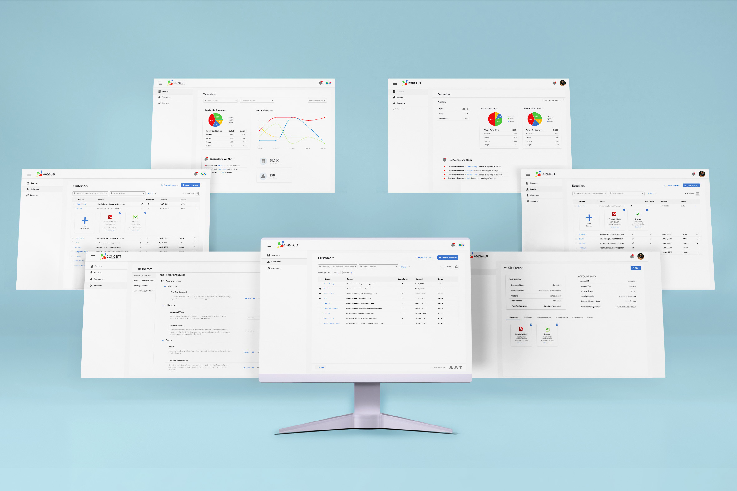
Concert Apps emerged from the vision of consolidating diverse applications under a unified cloud console and action director. The platform introduced two distinct software components: Proximity, Proviso and more. By merging various applications into a single interface, Concert Apps aimed to empower users, particularly sellers, with the ability to manage software functionalities seamlessly. My role in this project was to conceptualize the software's branding, visual identity, and functional capabilities. A significant challenge was determining the optimal number of features to incorporate into the app, ensuring that each feature contributed value to the product's launch.

Concert-image

Concert Application

0.2 Challenge

Concert Apps was designed to address the issue of application fragmentation. In today's tech landscape, users often have to navigate through multiple interfaces to access different software tools. This results in inefficiency, complexity, and a lack of synergy between applications. The goal was to create a centralized platform where sellers could efficiently control the software functionalities of Proximity and Proviso, making their workflow smoother and more effective.

Concert Application

0.3 Approach


Redesign and Enhanced User Experience:

  • 1. Understanding User Needs: Before delving into design and branding, I conducted comprehensive user research to understand the needs and pain points of potential users. This involved interviews, surveys, and analysis of competitor products to identify gaps and opportunities.
  • 2. Branding and Visual Identity: I developed a distinctive branding strategy for Concert Apps that conveyed its unifying concept. The visual identity reflected a seamless integration of various elements. Colors, typography, and imagery were carefully chosen to communicate cohesion, efficiency, and user-friendliness.
  • Feature Prioritization: Given the multitude of potential features, the challenge lay in identifying those that would truly enhance user experience and align with the product's goals. Through collaboration with stakeholders and iterative feedback cycles, I prioritized features based on their relevance and value.
  • User-Centered Design: The app's user interface and interactions were designed with a focus on simplicity and clarity. A logical and intuitive layout ensured that users could easily navigate through the software's capabilities.
Concert-image

Concert Application

0.4 Result

The transformation of Concert Apps yielded significant results:

  1. Unified Experience: The integration of Proximity and Proviso into Concert Apps streamlined the user experience for sellers, eliminating the need to toggle between different platforms.
  2. Efficient Workflow: The carefully curated features allowed users to perform essential actions seamlessly within a single interface, reducing complexity and enhancing efficiency.
  3. Branding Impact: The cohesive branding and visual identity reinforced the product's value proposition, communicating the idea of convergence and empowerment.
  4. User Adoption: The user-centered design approach resulted in an interface that users found intuitive and user-friendly, leading to higher adoption rates.

Concert-image

The Concert Apps case study exemplifies the successful transformation of a concept into a user-focused solution. By unifying applications, prioritizing valuable features, and crafting a compelling visual identity, Concert Apps provided users with an efficient and empowering platform. The challenge of optimizing feature inclusion was tackled through a strategic approach that ultimately contributed to the product's success and positive user reception.